Show posters and gallery cards: They’re glossy. They’re sexy. They’re collectible. And they can be incredibly desperately pigeonholing.
When presenting a show with a lot of DIY-grit based-solo obsession poured into it, advertising with white Helvetica she’s-all-that posters and gallery cards could be seen as disingenuous. And yet creating NO promotional material would not only be a cop out, but a disservice to the work done for going on a year.
The solution? Speak grunge.


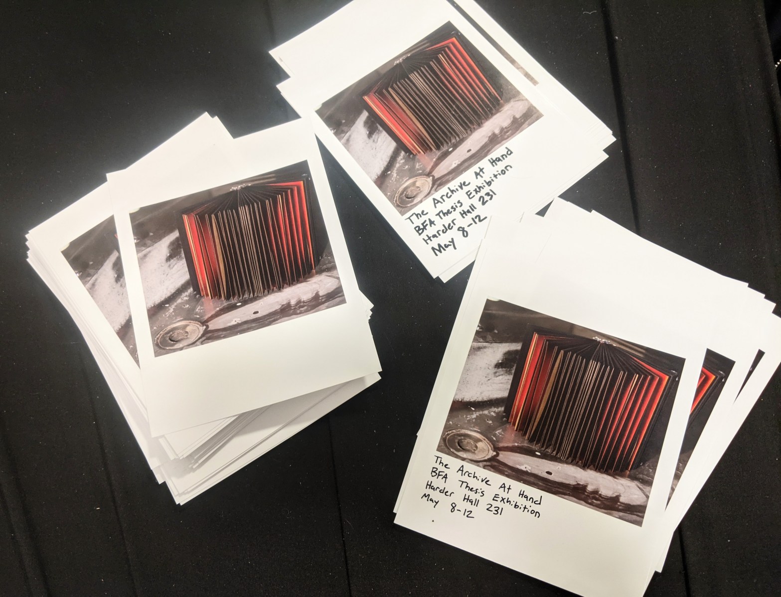
One little bitty polaroid-esque photo with sharpie writing is not a poster and looks cheap. But when you handwrite a million and a half of them, and hang them up in clusters of 6+ wherever you would usually hang a poster, well…. Then you’re underscoring the importance of handwork, series, material scavenging, surface, etc. that the entire thesis grappled with.
The age old dilemma: Manifesting concept while maintaining professionalism. Maybe I botched this attempt. But at least I’m going out with a strong choice. Better a strong, bad choice than a lazy default. Anyway, over and out.
